Color us trendy: We test out PANTONE�'s new it colors
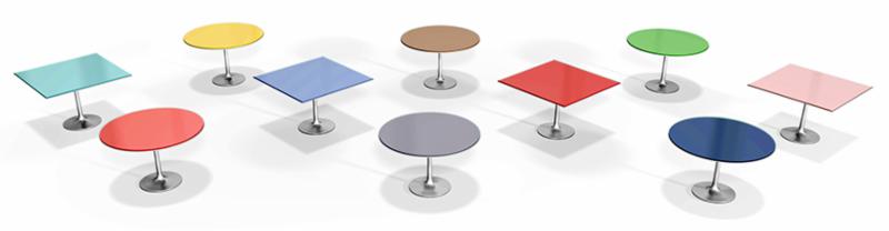
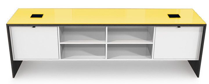
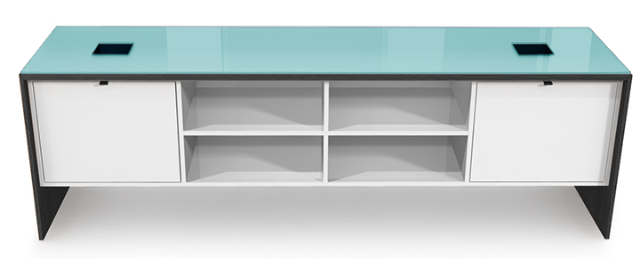
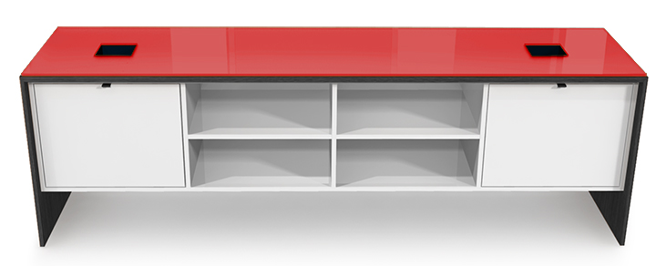
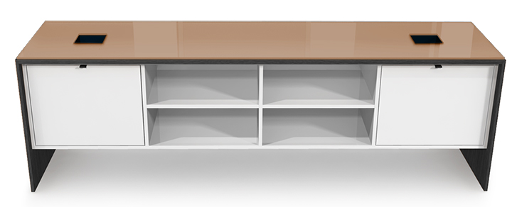
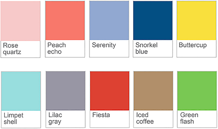
PANTONE� tells us spring's trends for fashion and furniture will be vivid and bright yet quiet and stable, transcending cultural and gender norms. One of our concept illustrators, Chuck Weaver, has applied these transformative spring 2016 shades to back-painted glass on some popular style caf� tables above.
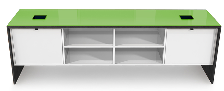
So what do you think? Does snorkel blue move you? Perhaps your taste leans more to limpet shell? Can these shades transcend the colorful caf� to the office, conference room or even the boardroom? Can bright hues
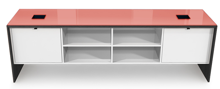
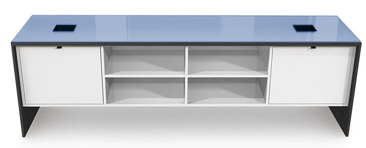
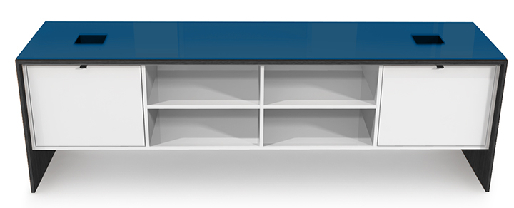
make it from the art on your walls to your credenza tops (shown right) or even your table tops? We can certainly build it. But can you envision it for your next space?
Here are the colors from PANTONE�. We've also included some swatches (at right). We look forward to helping you bring a little color into your next project, or not. We don't all have to transcend. Sincerely, John Wall CEO
|