Brilliant colors are to the artist as spices are the chef: too much high intensity can make a painting difficult on the eye, just as too much spice might send a dish back to the kitchen. At the same time, when strategically used, both high intensity (fully saturated hue) and spices are capable of creating total delight.
Take a look at this graphic.
In both images, the center square is high intensity red-violet. The outside square on the left is of an equally high intensity blue, but on the right the outer square is a lower intensity of same red-violet. Look at the one of the left and notice how your eyes have trouble deciding which color to look at. Now look at the design on the right and notice how your eyes are pulled towards the center square, even though it is the exact color as the one surrounded by high intensity blue.
(At the same time you might notice that as you were reading the previous paragraphs, you eyes were being distracted by the brilliance of the intensity in both squares just as they are NOW as you try to read this paragraph. In fact, as long as those squares are within your sight range, they will distract you. The amount of high intensity is overpowering.)
This is, in effect, the same thing that happens when the intensity within a painting is out of control. But high intensity colors can be used effectively when we accent small amounts by surrounding them with more neutral colors rather than over extending them in quantity. A painting of a red poppy, for example, will be more appealing if the intensity of the red is reduced in varying amounts with only accents of the highest intensity.
Intensity as an element is the saturation of hue in a color just as value as an element is the degree of light or dark.
Here's an example in which the highest intensity is placed in a small amount in the center, then progressive gradations of lower intensities lead to it. Notice how the more neutral the areas become, the calmer you eyes feel. Still, the color of the entire design feels very bright.
 |
|
Dianne Mize "Intensity Study" Computer Graphic
|
Tip: Just as dark contrasts with light, a neutral contrasts with saturation, therefore emphasizing it. When using high intensity colors, try using less in amount than you think you need, and instead, surround it with more gradual neutralized versions of the same color. You'll be surprised at how much more intriguing the work will be.
Happy painting,
Dianne
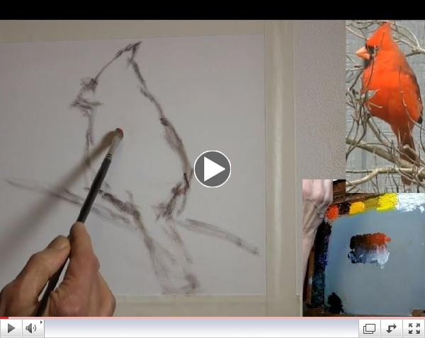
P.S. Using a male cardinal as a model, this week's video shows one way to use small amounts of high intensity red and emphasize it by using black to lower the intensity.
 |
| Dianne Describes Lesson 2 of Series 1 |
P.P.S. The Facebook forum now has over 550 members, some who are sharing their art work. We have twenty-four challenges for you to play with. You can do any challenge at any time.
AND with a new video Tip now rolling out every week, each person on the forum who does a study based on the video Tip and shares it on the forum will receive a 20% off coupon towards the following week's video.