|
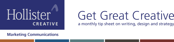
Google+ to Internet: "I'm not dead!"
|
| Tech bloggers have been waiting four long years to be right about the demise of Google+. They've been wrong thus far, but their death watch continues.
|
Premature obituaries of the famous and powerful are not new to the Internet. In 2008, Bloomberg News accidentally released a 17-page obituary for Steve Jobs, who lived another three years. In the following months, Miley Cyrus was claimed killed in a car accident - twice - before apparently forgoing eternal rest to perform a few days later. And CNN.com gets the prize for most pre-death death announcements, having briefly made public in 2003 a collection of just-in-case obits written for Ronald Reagan, Gerald Ford, Fidel Castro, Nelson Mandela, Bob Hope, Dick Cheney and Pope John Paul II. As a son of Google, Google+ was famous and powerful at birth - and declared D.O.A. when it launched in 2011 as the not-Facebook/not-LinkedIn social/business network. In the four years since, it has survived frequent reports by tech bloggers of its imminent demise. New death notices were posted last month, when Google announced that it is decoupling Google+ from its other services, including Gmail and YouTube. On the back end, it means Google+ is no longer the single data-point from which Google tracks users across all its entities. For the average user, the change is mainly cosmetic: a link to their Google+ account no longer appears across the top of most pages, but instead is relegated to a sub-navigation menu. Google also announced that it is no longer showing a company's Google+ news feed posts on the "Knowledge Graph" information panel, which appears on the right side of Google's search engine results pages (SERPs). A fresh round of Google+ obits appeared. But once again, the death knell rings untrue. By removing Google+ from the spotlight, Google has seemingly accepted the fact that this son is never going to be homecoming king. However, sonny might make the Science Olympiad team because Google loves data, and Google+ Business pages give the search engine oodles of it. The "address and hours" information that appears in maps and search results is pulled from G+ business pages, and the posts made to a company's G+ feed provide keyword data about its products and services. In fact, Google+, like the hapless not-dead man in Monty Python and the Holy Grail, could claim not only "I'm not dead" but also "I'm getting better." As a result of the recent changes, some tech bloggers are speculating that a Gmail address - not a Google+ account - will soon be sufficient to post an online review about a business. This would remove a major barrier to gathering super-SEO-boosting reviews for your business. The take-away is this: Until Google+ is morally, ethically, spiritually, physically, positively, absolutely, undeniably and reliably dead, it will continue to be a major component of searchability for local businesses and brands. Quiz: Dearly and not-so-dearly departed
The first three readers to email us the correct answer to all three quiz questions will win a Hollister Creative branded, very-limited-edition, "Get Creative" athletic shirt that may or may not be available in your size. -
|
| |
Hollister Creative team members Georgette, Kyle, Heidi and Max were among 14 people wearing our branded athletic shirts in the 5K Corporate Fun Run/Walk held to raise funds for Bringing Hope Home.
|
Of the seven men cited above for whom CNN accidentally made public pre-written obituaries on April 16, 2003, which ones are still alive today? - What is the name of the Tony Award-winning Broadway musical inspired by Monty Python and the Holy Grail?
- Our take-away alludes to an exchange between two Munchkins about the need for a coroner to examine the wicked witch and verify that she is not only merely dead, she's really most sincerely dead. Which two Munchkins are conversing?
Have a marketing challenge? Call Kim Landry at 484-829-0021 or email kiml@hollistercreative.com.
|
|
What's up with your asterisks?
|
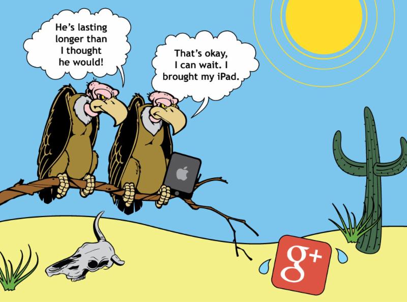
| What's the difference between an asterisk and an ass-trick? An asterisk is a punctuation mark.
An ass-trick is Pinky the donkey rollerskating at the head of a conga line. |
The asterisk is a cute little symbol. Its name is derived from the Greek word aster, or "star," and literally translates to "little star."* But like most cute things (puppies and children, for example), asterisks quickly become annoying when they don't follow the rules. Such is the case with the asterisk used at the end of the previous paragraph. When most readers see an asterisk, they correctly expect that it connects the foregoing piece of information with an additional piece farther down the page that is preceded by an asterisk, such as a footnote, source attribution or disclaimer. However, a search of this newsletter will yield no such result. The connection was dropped like a cellphone call in a canyon. We most often see incorrect use of asterisks to ***call attention to a piece of text*** or break up sections of a document. Asterisks are not meaningless doo-dads, decorations or design elements. They have one purpose: to indicate and lead the reader to related information. On second thought: two purposes, as they can also serve as a letter substitute in certain f***-letter words. When you find yourself tempted to use one or more asterisks, consider the following: - Don't use asterisks to call attention to a piece of text. Use bold or italicized text instead.
- Don't use asterisks to break up text or set off new areas of a document. Use a cleaner design element, such as a line or a bullet.
- Don't hide the footnote. When using an asterisk correctly, place the corresponding footnote, source attribution or disclaimer on the same page.
- Do think twice about double or triple asterisks. If you need more than one on a page, a better choice is to use numbered footnotes. If you must use asterisks, use a double asterisk for the second citation and a triple for the third.
In writing for marketing or business communications purposes, even one asterisk should be rare. Too many asterisks and the reader will wonder what's up with your ass-tricks. Need help writing or editing for your website or blog? Call Kim Landry at 484-829-0021 or email kiml@hollistercreative.com.
|
|
Beware of banner blindness
|
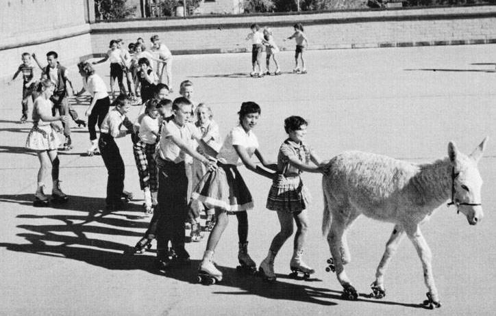
| Eye-tracking studies generate reports that look like heat maps. These reports show where the eyes of web page viewers traveled and lingered. Notably, they also show that barely a glance was given to the banner ads on these web pages.
|
Q: A design-savvy family member recently told me that "banner blindness" was hurting a promotion on my organization's website. What is she referring to? A: Known fact: Staring at the sun all day long will make you blind. Lesser-known fact: Staring at the Internet for hours on end will also make you blind. Banner blind, that is. Banner blindness is a web user's reaction to the banner advertisements displayed on many web pages. The ads are trying to stand out by looking different from the rest of the content on the page. This helps viewers to instantly recognize ads as ads - and ignore them. Blindness to elements that don't fit in with the overall page design can be a problem for a web designer who is trying to call attention to a piece of content. Efforts to make it stand out can actually make it invisible. A recent eye-tracking study by the Nielsen Norman Group placed participants in front of a screen showing a page on the U.S. Census Bureau website. The page had a big, bright red counter of the country's population in the upper right hand corner. Yet, only 14% of the users could find that information when instructed to do so. Because of the counter's location (on the upper right side) and design (a color and font not found anywhere else on the page), 86% of users passed right over it after mistaking it for an ad. To combat banner blindness, keep important content, such as your current promotion, to the left or center of the page and well integrated into the overall design of the content. While it's fine to call attention to a piece of content using color and font styles, be sure to stay within the site's branded color palette and font families so that the highlighted content won't be mistaken for an ad. The secret weapon for calling attention to a piece of content? Pair it with a photo of a human face. Numerous studies have that shown that humans love to look at faces. No one's ever heard of Brangelina blindness. Need help with design for your business website, publication or marketing collateral? Call Kim Landry at 484-829-0021 or email kiml@hollistercreative.com.
|
|
Re-engaging an audience in 'plane language'
How can we re-engage an audience that hasn't thought about us in months, and do it in a way that's attention-grabbing yet consistent with our brand? In business terms, that was the challenge facing leaders of Agora Cyber Charter School as they sat down to plan an August mailing to enrolled students and their families. One goal was to get new and returning students excited about the start of school. Another was to oil the mental machinery that had been on vacation since June. And yet another was to provide important back-to-school information. To achieve multiple goals, Agora leaders envisioned a packet with multiple elements. To generate excitement, they would enclose a balsa wood airplane. To get the mental gears moving, they would enclose a learning activity sheet using the plane to teach the scientific method of inquiry in a fun way. To provide school and coming events information, they would enclose a newsletter that doubles as the 2015-16 school calendar. They named the packet "Summer Soar." |
| Agora Cyber Charter School's "Summer Soar" packet included a branded balsa wood airplane.
|
Our Solution
Hollister Creative's job was to get this project off the ground and make it fly - quickly. That involved multiple people tackling different tasks simultaneously. One designer created the Summer Soar logo that would appear on the outside of the envelope and tie the interior pieces together. Another designer worked with a content specialist on the four-page newsletter/calendar, and worked with a curriculum writer on the activity sheets - one teaching elementary-level skills and another teaching at the secondary school level. Production was the final hurdle. We had to get 8,500 packets printed, assembled and mailed in short order. To save time and ensure continuity, we chose one production company that could do everything: source the balsa plane and get the Agora logo printed on its wings; print the activity sheet, newsletter and envelope; put everything into the envelopes, address them and mail them. Agora students and families received an intriguing package with an uplifting design. It reinforces the Agora brand promise of a personalized, innovative and intensive academic preparation program in a positive learning environment.
Three Quick Tips
If you are facing the challenge of re-engaging an audience, here is some advice that may help: - Remind them why they chose you. This is not the time to tell the audience about all of the changes you have made since they last engaged. Reinforce the brand qualities they know and love.
- Be clear about your goals. The decision about what to send should be based on why you are sending it. Ask yourself what you want the recipients to think, feel and do as a result.
- Consider a promotional item. Including some little "thing" can make your outreach more memorable. It will be perceived as a free gift, and appreciated if it is fun or useful - preferably both!
Challenges and Solutions are mini case studies that include tips you may find helpful if you are facing a similar challenge. View more Challenges and Solutions on the Hollister Creative website. If you are facing a marketing challenge, call 484.829.0021 or email Kim Landry.
|
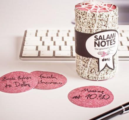
Take note: Free salami here!
It's time to meat - err, meet - your new favorite notepad. Use these faux-salami stickies to lighten the mood around the office and cure your beefs with salty co-workers. Or, scribble down your fermented ideas and save them for later; there's no shelf-life limit for these spicy slices of wisdom. The first five readers who have not won in six months and email us a request for the Salami Memo Notepad will receive one. |
|
|