|
Customer Sign-ups is what being in business on the Internet is all about. Building your customer base is a long and tedious process. However, if your form isn't well designed you may be losing valuable opportunities.
Let's first look at what a sign-up form is and what it is not. A sign-up form is meant to collect names and emails of those who are interested in your product or service. They may or may not become your client or customer, but they have raised their hand and said I have an interest.
What it is not is a way to bombard your customers with marketing messages. Offer them free information, and upgrade options later. Your job is to take them from interested to customer. This can be done only by building a relationship with them. They need to trust you before they will take that step.
Now let's look at your sign-up form. Is it easy to spot? Is the relevant information front and center? Are you asking for way too much input? Is it too subtle or over-designed? All these are factors that could be detrimental to your business sign-ups.
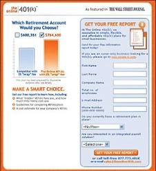 The actual design of your form should be simple and request only the name and e-mail address. Any other information you want to collect should be obtained at a later date. Yes, a comments box could be included, but maybe your confirmation e-mail can offer that opportunity. That's your call. The actual design of your form should be simple and request only the name and e-mail address. Any other information you want to collect should be obtained at a later date. Yes, a comments box could be included, but maybe your confirmation e-mail can offer that opportunity. That's your call.
Make sure your form is placed in the top third of your webpage-above the fold. Right or left? Who's to say? This is debatable. More importantly is the color scheme and design. The theme should match your site. If your site is fun and funky, so too should your form be. If it is corporate, then clean and polished looking will do the trick. You get the picture?
Colors should be accent colors to your site. To get an idea of what those are look to a color wheel. There are numerous ones available and some even go into excruciating detail. Lightly highlight the fields you require to make them easy to spot. If you have a sectional sign-up form, why not consider some nice iconography to accent those sections. These additions make it easy for the registering visitor to know at a glace the information you need. Keep it logical and clean. Drop shadows are not necessary and neither are gradients. Keep it simple and uniform but not dull.
Now let's turn to the fonts. Headlines should be that, headlines. Make them a size or two larger than your descriptive text or bold them to save space. When defining headlines vs. body text the norm is sans serif headlines and serif text or visa versa. Instructions should be clear, easily readable and understandable without having to hunt for them.
Talking about saving space, if you this is an issue for you, why not put the form labels in the form field. This saves space by eliminating the form labels while ensuring the right information is replaced in the correct field without any confusion.
What about the buttons? Should you have a reset button, or just  submit? The answer is simple, what do you want them to do? I would guess you want them to submit. Therefore, use one button that clearly states your intended purpose, "Submit". There's no need for special wording. Tell them what you want them to do in the language they are used to seeing. Remember, confusion breeds loss. Keep things clear and easy to understand. However, words like 'Sign me up now', 'Get my report' and a few others may be relevant to your situation. Just be crystal clear with your instructions. submit? The answer is simple, what do you want them to do? I would guess you want them to submit. Therefore, use one button that clearly states your intended purpose, "Submit". There's no need for special wording. Tell them what you want them to do in the language they are used to seeing. Remember, confusion breeds loss. Keep things clear and easy to understand. However, words like 'Sign me up now', 'Get my report' and a few others may be relevant to your situation. Just be crystal clear with your instructions.
If you have a lot of information you need to provide to explain your offer why not put the form on one side and the text on the other. This helps keep the information logically in one place rather than the top to bottom approach.
And lastly, remember, the information you need to collect will dictate the form fields and the design of your form. Keep it logical, clean, and easy to read and you'll have a workable form that functions as you intended. Oh and don't forget to test! We wouldn't want you to miss a sign up because your form didn't work.
© Copyright 2011 Ginger Marks
Ginger Marks is the founder of the DocUmeant Family of Companies, We Make YOU Look GOOD! For more information, visit http://www.documeantdesigns.com/. Her 2011 annual edition of Holiday Marketing Guide, Your business-marketing calendar of ideas is now available at http://www.HolidayMarketingGuide.com.
|